
Every December, Coca‑Cola seems to bounce back everywhere at once — glowing red trucks, cheerful Santas, glass bottles catching the light. But long before modern holiday commercials, Coca‑Cola was already shaping what Christmas refreshment looked like. This season, I’ve been slowly collecting original Coca‑Cola print ads dating from 1911–1941, and they feel like small time capsules: equal parts marketing, illustration, and cultural history.
This felt like the perfect moment to share what I collected so far!
Coca‑Cola: Early 1900s Advertising History
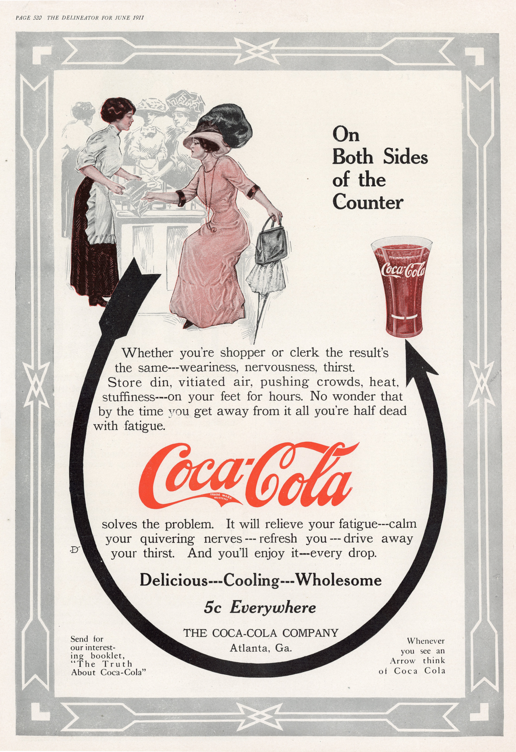
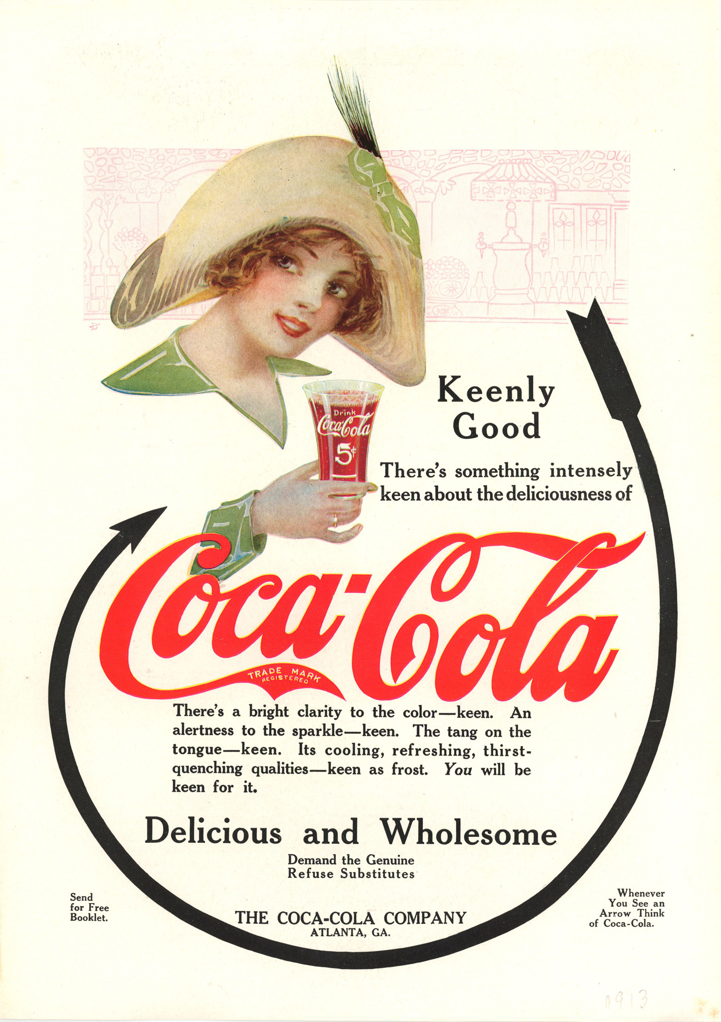
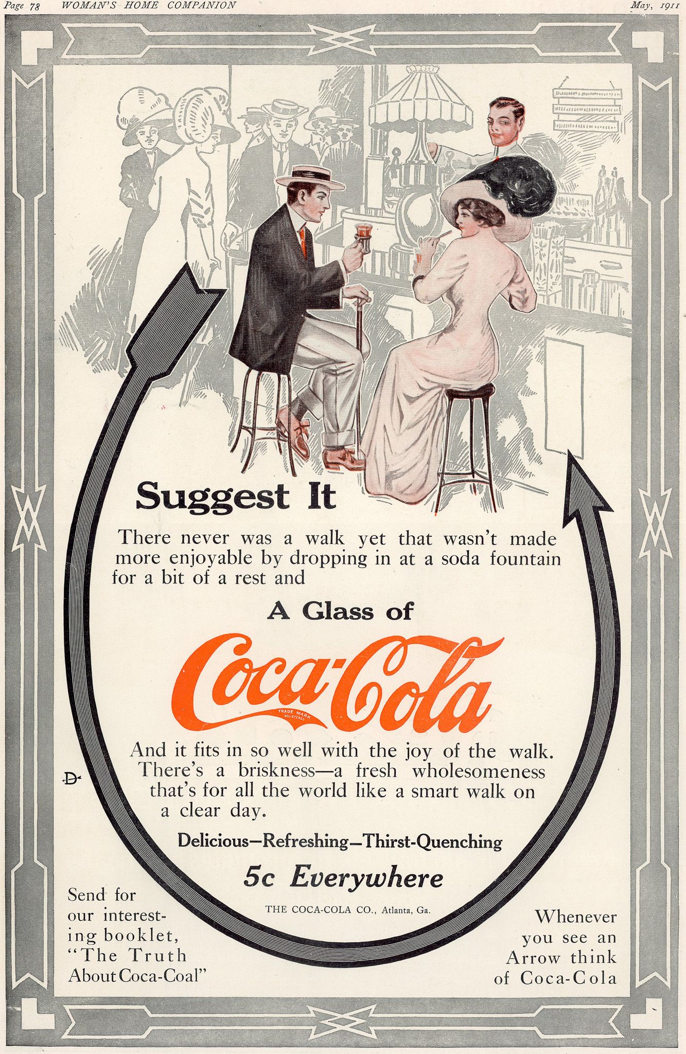
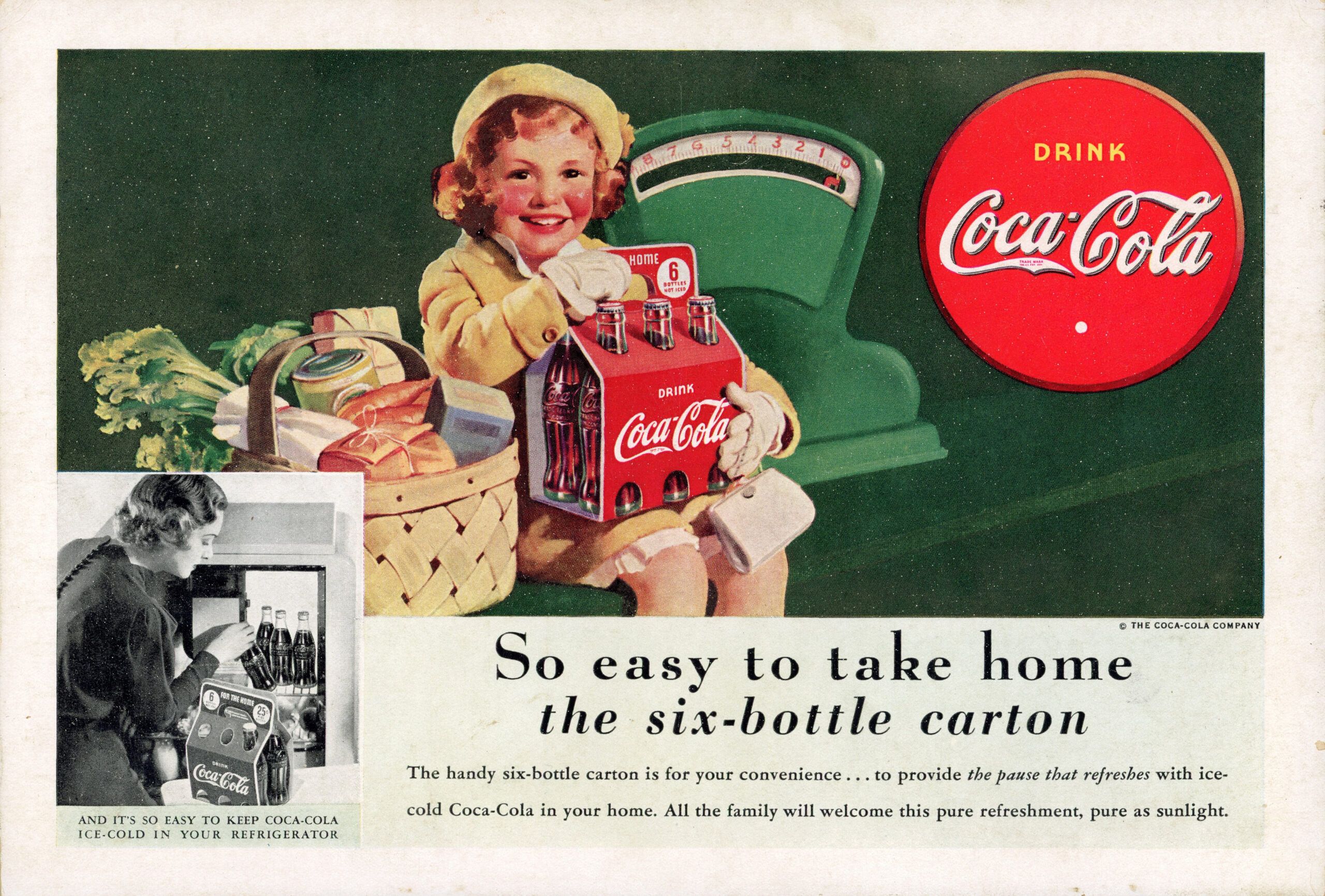
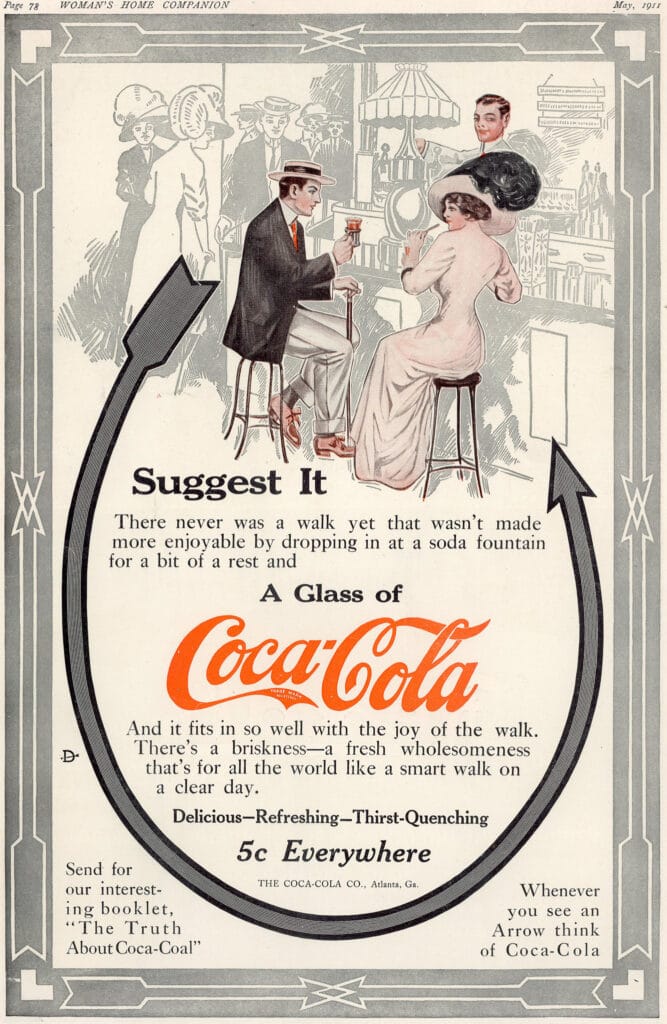
In the early 1900s, Coca‑Cola advertising was almost entirely print‑based. These ads ran in widely read publications, however I got mine from magazines like The Delineator, Woman’s Home Companion. They were often aimed at shoppers, clerks, families, and women navigating busy daily routines.
What stands out immediately is the language. Coca‑Cola wasn’t just a drink — it was a pause. A reset. A socially acceptable reason to stop, sit, and breathe for a moment. Phrases like “The pause that refreshes,” “Delicious and Wholesome,” and “5¢ Everywhere” appear again and again, reinforcing comfort, reliability, and accessibility during a time when daily life was physically demanding and often exhausting.
Even the early, pre‑Santa ads (circa 1911–1920s) focus on soda fountains, shopping breaks, and social rituals. Coca‑Cola positioned itself as something shared… across the counter, on a walk, or during a small moment of rest.
How Coca‑Cola Shaped the Modern Santa Image
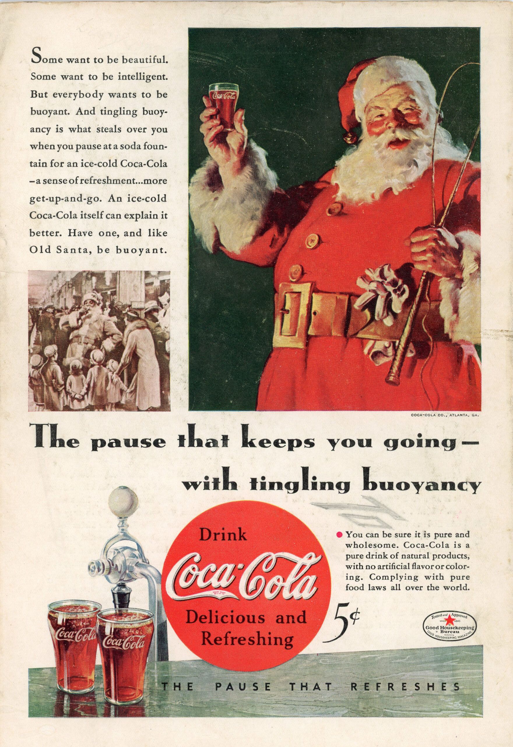
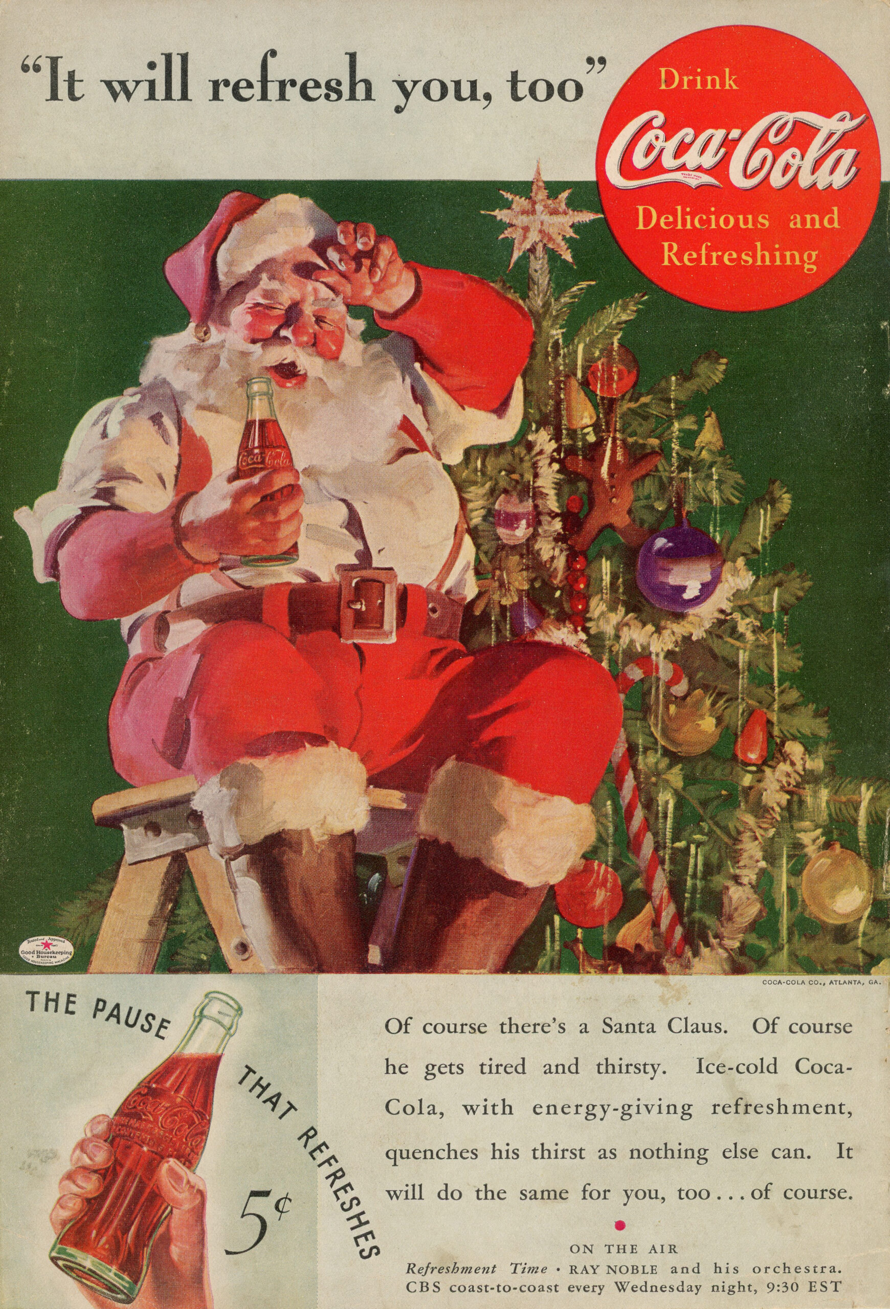
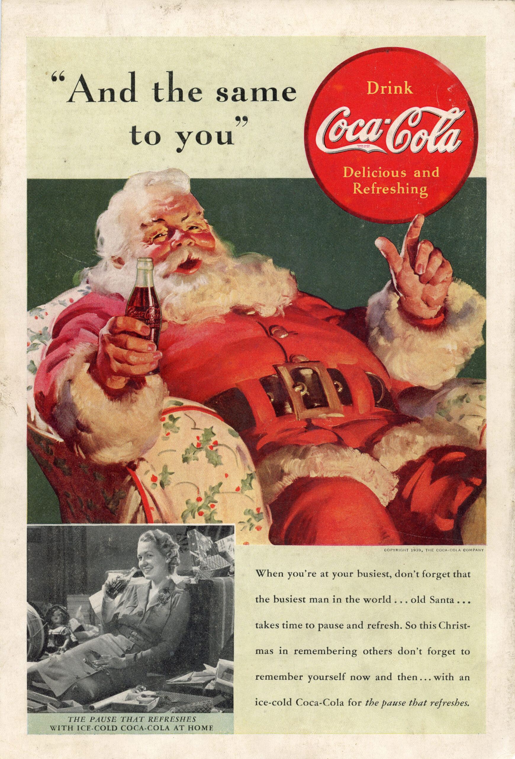
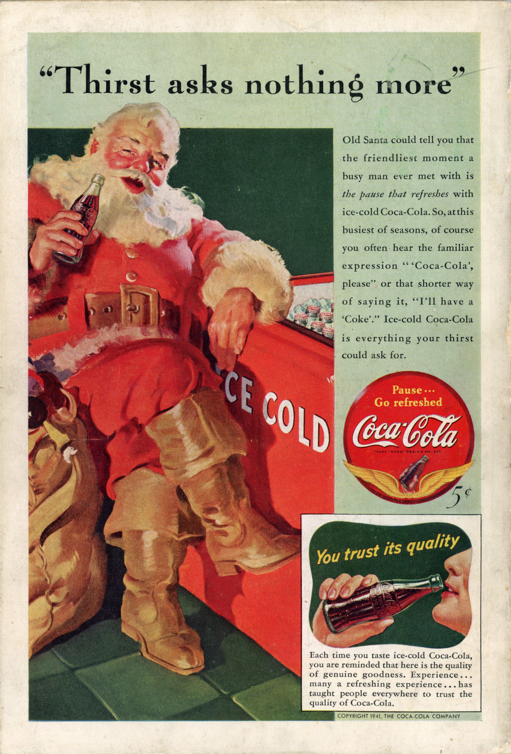
By the 1930s and early 1940s, Coca‑Cola’s holiday imagery became more defined and much closer to what we recognize today. Santa appears not as a distant symbol, but as a tired, friendly, human figure who needs refreshment just like everyone else.
These ads helped solidify the modern image of Santa: red suit, warm expression, approachable presence. He’s often shown mid‑pause sitting, smiling, drinking reinforcing the same message Coca‑Cola had been telling for decades: even the busiest person in the world deserves a moment to rest.
Why These Vintage Coca‑Cola Ads Are Still Around Today
Looking at these pieces now, over a century later, they don’t feel loud or aggressive. They feel calm. Intentional. Human. They remind me that good design and good storytelling doesn’t need to shout. It just needs to understand people. That’s probably why these ads still resonate. They weren’t trying to create urgency. They were offering a quiet moment of ease.
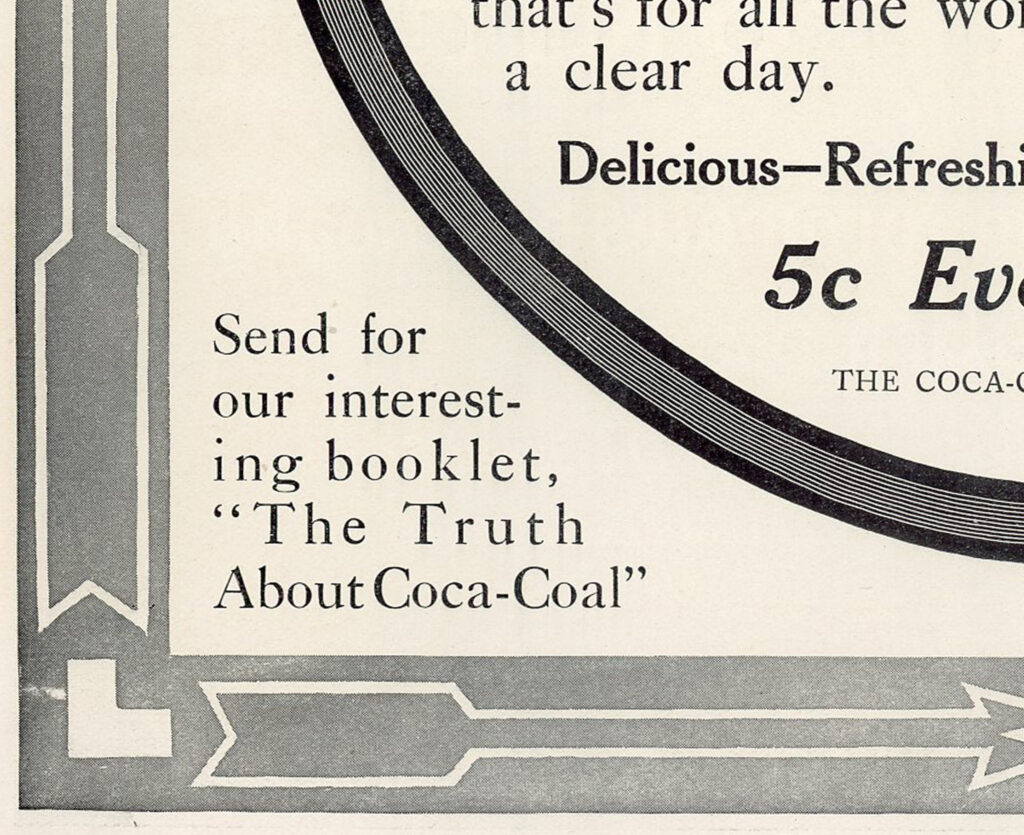
There are small imperfections too. One of the ads even includes a minor typo tucked into the bottom corner, a quiet reminder that these were physical, printed objects. They weren’t endlessly revised, A/B tested, or polished into perfection.
They were designed once, printed, and released into the world (although still very curious about the typo!)
A Personal Connection to Coca‑Cola (My Atlanta Roots)
I also can’t separate these ads from my own history with the brand. I grew up just outside of Atlanta, where Coca‑Cola was simply part of the environment. I knew people who worked for the company. Restaurants almost always served Coke over Pepsi. The branding was everywhere, familiar enough to feel unremarkable.
Looking at these early ads now, decades later, that familiarity takes on a different meaning. They bring the brand back to a quieter, more grounded place, one that feels rooted in ordinary routines rather than spectacle or nostalgia.
Signing off with a Christmas Note
If you’re reading this during the holiday rush, between trips, deadlines, plans, and obligations, consider this a small invitation to slow down.
Take a walk. Sit with a drink. Step away from the noise, even briefly.
Thank you to everyone who takes the time to read, support, and spend a moment here. I hope the end of the year offers you some rest, clarity, and space before whatever comes next.
Wishing you a peaceful holiday season and an easy transition into the new year